Visiting Card Design and Color Psychology
Outline
H1: Introduction
- Importance of visiting cards in professional branding
- The role of design and colors in creating a lasting impression
H2: Understanding the Basics of Visiting Card Design
- Standard dimensions and layout
- Key elements: Logo, name, designation, and contact information
- Why simplicity is crucial
H2: The Psychology of Colors in Marketing and Design
- Introduction to color psychology
- How colors influence perception and behavior
H3: Meaning of Common Colors in Visiting Card Design
- H4: Red: Energy, passion, and urgency
- H4: Blue: Trust, calmness, and professionalism
- H4: Green: Growth, harmony, and balance
- H4: Black: Elegance, power, and formality
- H4: White: Simplicity, purity, and clarity
- H4: Yellow: Optimism, creativity, and warmth
- H4: Orange: Enthusiasm, friendliness, and confidence
H2: Choosing the Right Colors for Your Visiting Card
- How to align colors with your brand identity
- Balancing contrasting and complementary colors
H2: Typography and Fonts in Visiting Card Design
- Importance of readable fonts
- Matching font style with color schemes
H2: The Impact of Materials on Design Perception
- Matte vs glossy finishes
- Specialty materials (metallic cards, recycled paper, etc.)
H2: Mistakes to Avoid in Visiting Card Design
- Overcrowding with information
- Poor color combinations
- Ignoring printing quality
H2: Examples of Effective Visiting Card Designs
- Minimalist designs
- Bold and creative layouts
- Industry-specific inspirations
H2: Designing for Specific Industries
- Creative industries (e.g., art and photography)
- Corporate sectors
- Healthcare and wellness
H2: Digital vs. Traditional Visiting Cards
- Rise of digital business cards
- Benefits of physical cards in networking
H2: Tips for Creating a Memorable Visiting Card
- Adding a call to action
- Using QR codes for instant connectivity
- Personal touches (handwritten notes, embossing, etc.)
H2: Tools and Software for Designing Visiting Cards
- Popular design tools (Canva, Adobe Illustrator, etc.)
- Templates vs custom designs
H1: Conclusion
- The lasting impact of thoughtful design and color choices
- Importance of aligning design with brand message
H1: FAQs
- What is the best color for a professional visiting card?
- Can I use multiple colors in my visiting card design?
- How do I choose the best material for my visiting card?
- Are digital business cards replacing traditional ones?
- What software is best for beginners to design visiting cards?
Visiting Card Design and Color Psychology
Introduction
Ever wonder why some visiting cards immediately grab attention while others fade into the background? Visiting cards are more than just a medium to share your contact information—they’re a reflection of your personal or professional brand. And when it comes to design, every detail matters, especially colors! In this article, we’ll delve deep into how thoughtful design and strategic use of colors can make your visiting card unforgettable.
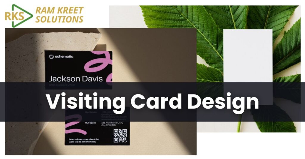
Understanding the Basics of Visiting Card Design
When designing a visiting card, simplicity often reigns supreme. A cluttered card can confuse the recipient and undermine your professional image. Let’s look at some must-have elements for an effective design:
- Standard Dimensions: The typical size is 3.5 x 2 inches, ensuring it fits wallets and cardholders.
- Key Elements: Always include your logo, name, designation, and up-to-date contact details.
- Simplicity: Resist the temptation to overfill your card. Remember, less is more!
The Psychology of Colors in Marketing and Design
Colors aren’t just visual stimuli—they evoke emotions and influence decisions. This is where color psychology comes in. Whether you want to appear trustworthy, energetic, or creative, the right color choice can subtly communicate your message.
Meaning of Common Colors in Visiting Card Design
Red: Energy and Passion
Red is bold, attention-grabbing, and energetic. Perfect for industries like entertainment or sports.
Blue: Trust and Professionalism
A favorite for corporate settings, blue symbolizes trust and calmness. Think financial firms or tech companies.
Green: Harmony and Growth
Green resonates with eco-consciousness and growth, making it ideal for environmental and wellness brands.
Black: Elegance and Power
For luxury brands or high-end services, black exudes sophistication and formality.
White: Simplicity and Clarity
White works well as a background to create clean, minimalistic designs.
Yellow: Optimism and Creativity
Yellow sparks joy and creativity, great for creative professionals or startups.
Orange: Enthusiasm and Confidence
Orange is playful yet confident, suitable for businesses looking to appear approachable.
Choosing the Right Colors for Your Visiting Card
Selecting colors isn’t just about aesthetics; it’s about alignment. Here’s how to choose wisely:
- Align With Brand Identity: If your logo is predominantly green, your card should echo that palette.
- Balance Colors: Use complementary or contrasting colors for readability and impact.
Typography and Fonts in Visiting Card Design
Even the most stunning color scheme can fall flat if the text is unreadable. Opt for legible fonts that pair well with your color scheme. Avoid overly decorative fonts, especially in small sizes.
The Impact of Materials on Design Perception
Design isn’t limited to visuals. The material of your card also speaks volumes about your brand:
- Matte Finish: Subtle and sophisticated.
- Glossy Finish: Eye-catching and vibrant.
- Specialty Materials: Metallic finishes or recycled paper can make your card stand out.
Mistakes to Avoid in Visiting Card Design
Avoid these pitfalls:
- Overloading information
- Using mismatched or clashing colors
- Ignoring print quality
Examples of Effective Visiting Card Designs
From minimalist designs to bold layouts, great cards showcase creativity and clarity. For example:
- Minimalist: Clean lines and ample white space.
- Bold: Vibrant colors and unique shapes.
- Industry-Specific: Tailored designs for healthcare, tech, or creative fields.
Conclusion
Your visiting card is often the first impression of your brand. By combining thoughtful design elements with strategic color psychology, you can create a card that leaves a lasting impact.
FAQs
- What is the best color for a professional visiting card?
Blue or black are generally safe, professional choices. - Can I use multiple colors in my visiting card design?
Absolutely! Just ensure they complement each other. - How do I choose the best material for my visiting card?
Consider your industry and audience. Matte is versatile, while metallics add luxury. - Are digital business cards replacing traditional ones?
Not entirely—traditional cards still have a personal touch that digital ones lack. - What software is best for beginners to design visiting cards?
Tools like Canva are beginner-friendly, while Adobe Illustrator offers more advanced options.